Thinking in Spreads


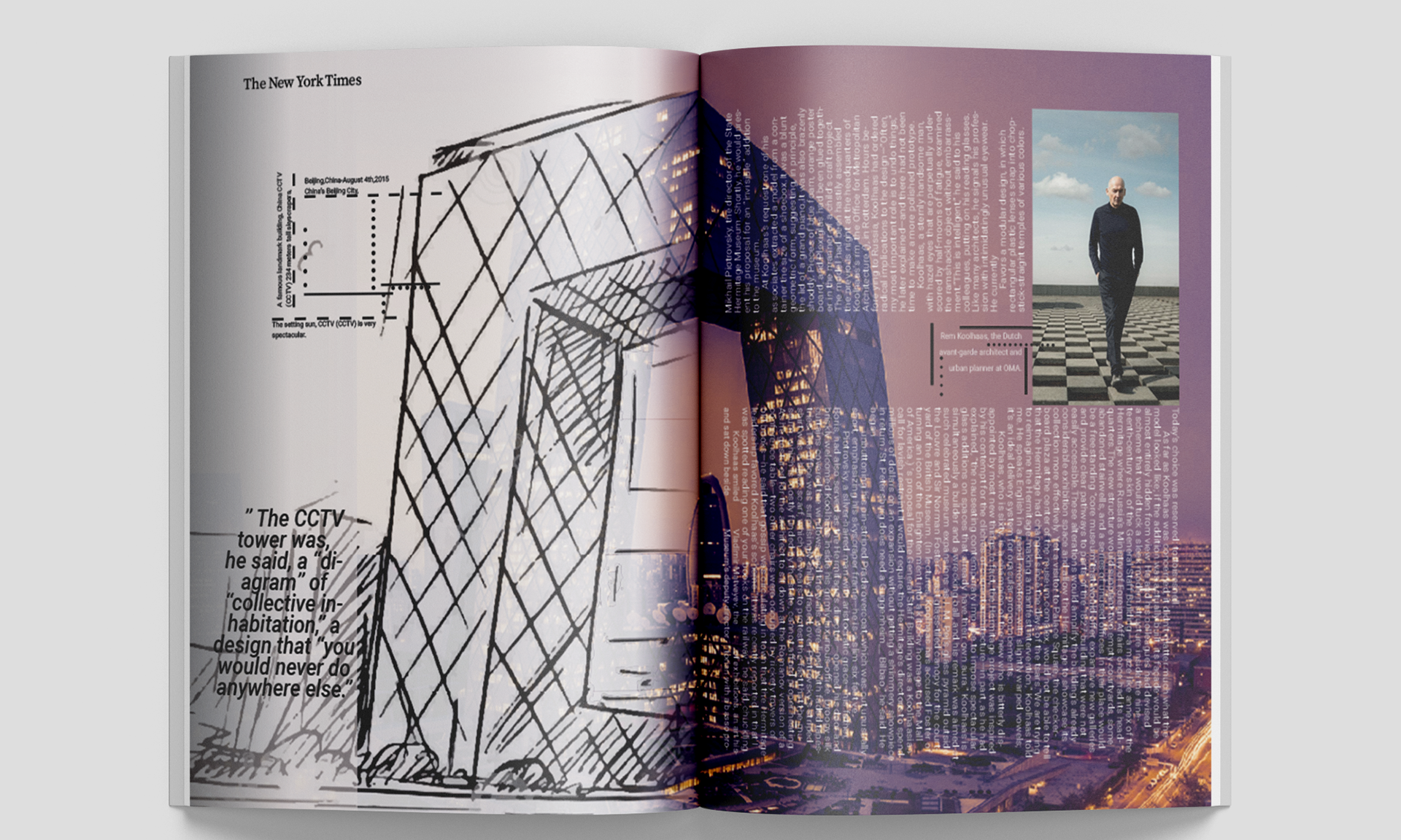
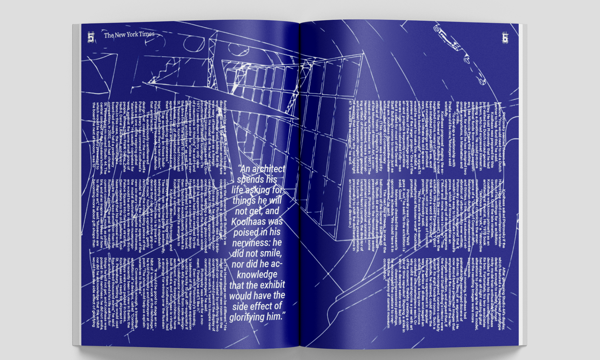
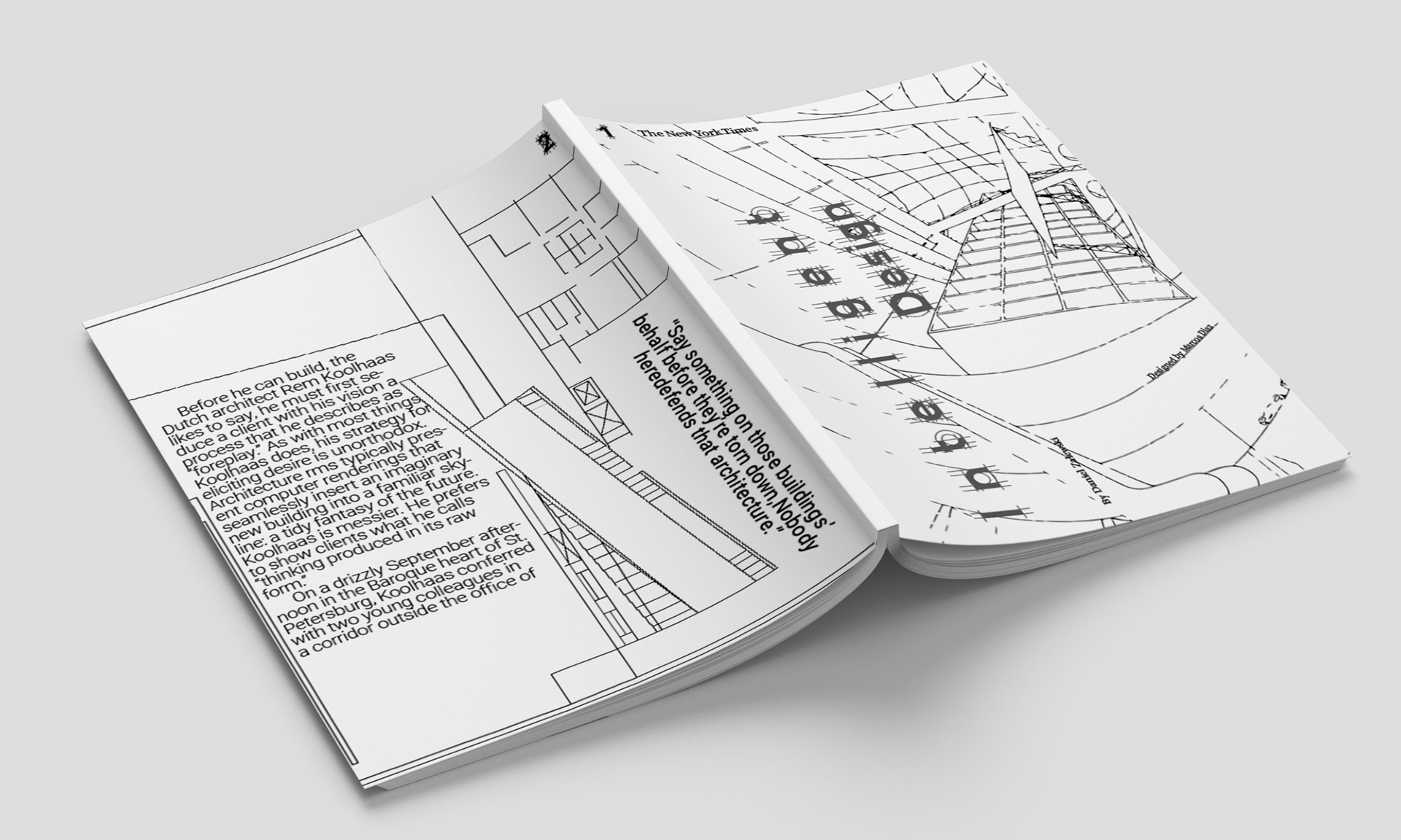
Thinking in Spreads: This 6-page zine draws inspiration from the design style of Rem Koolhaas, a renowned Dutch architect known for his innovative and intellectual designs. The zine presents a carefully crafted representation of his work through the use of blueprint layouts. It includes a floor plan, a partial sketch of the China CCTV building, and a blueprint. The caption design incorporates lines and dots to emphasize the structural elements of Koolhaas' designs, while also utilizing typography to establish distinct hierarchies that enhance the overall composition of the graphics
Confidence is Key
Efficient Text Placement: Successfully condensing a significant amount of text within a limited space can pose challenges. However, I devised an inventive approach to make 40 quotes from renowned graphic designers not only legible but also interconnected in a narrative context for this poster. To achieve this, I employed two distinct geometric layouts, carefully dividing the text into cohesive sections. By utilizing a key-like arrangement, one segment descends vertically while the other originates from the side before descending. This structural emphasis was further reinforced by employing a complementary color palette, specifically black and light blue Pantone shades, to accentuate the concept of contrast. Additionally, meticulous adjustments were made to leading, kerning, and font selection to ensure the given text fitted harmoniously and maintained its readability.
