This poster was meticulously crafted for the esteemed Design Culture Now event hosted at the renowned Cooper-Hewitt, National Design Museum in New York City. It serves as an artistic exploration of typefaces, skillfully combining vibrant and muted color palettes to establish distinct hierarchies that elevate the overall graphic composition. The result is a visually captivating display akin to a mesmerizing light show, captivating the audience and further enhancing the event's atmosphere.
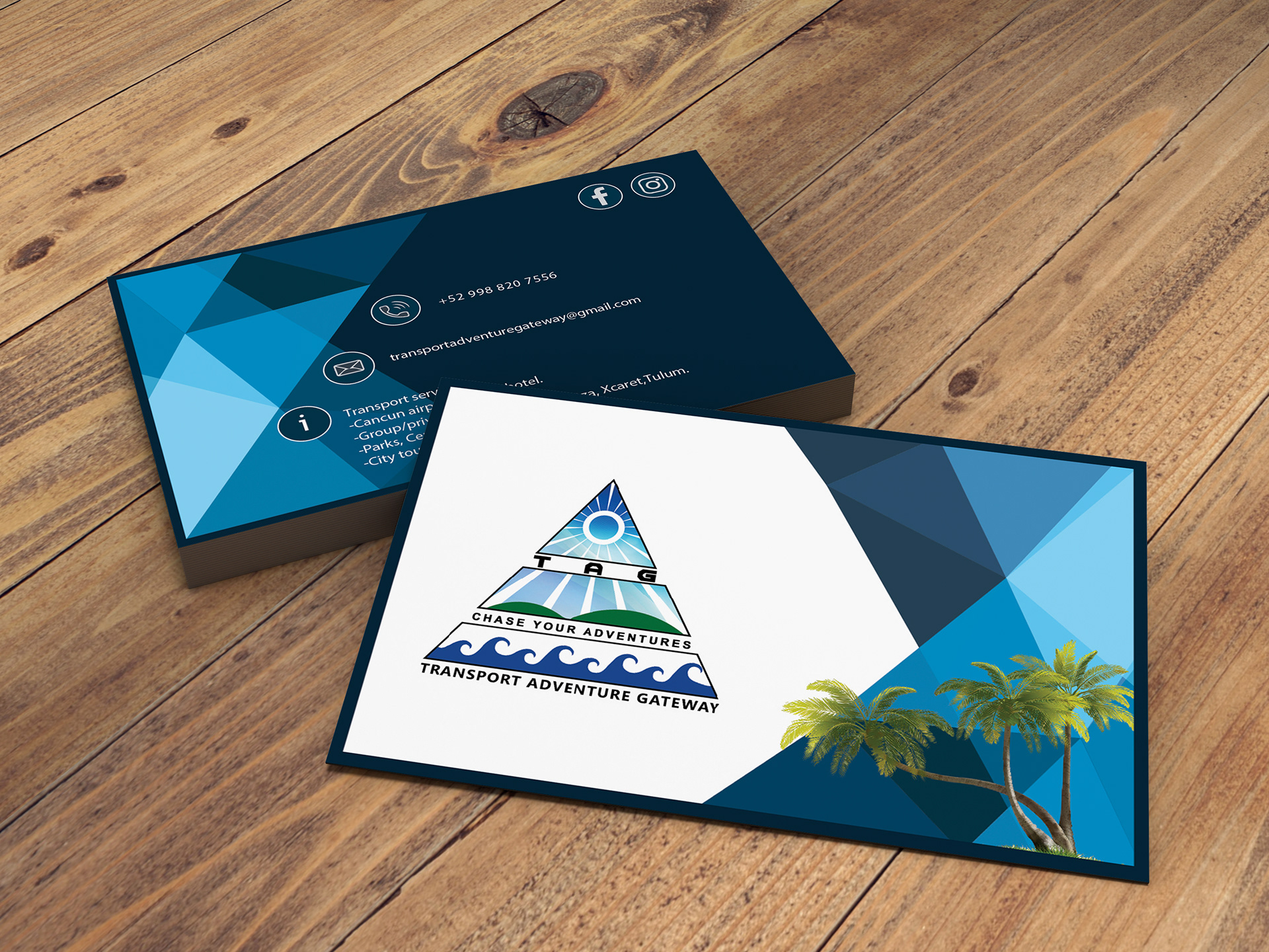
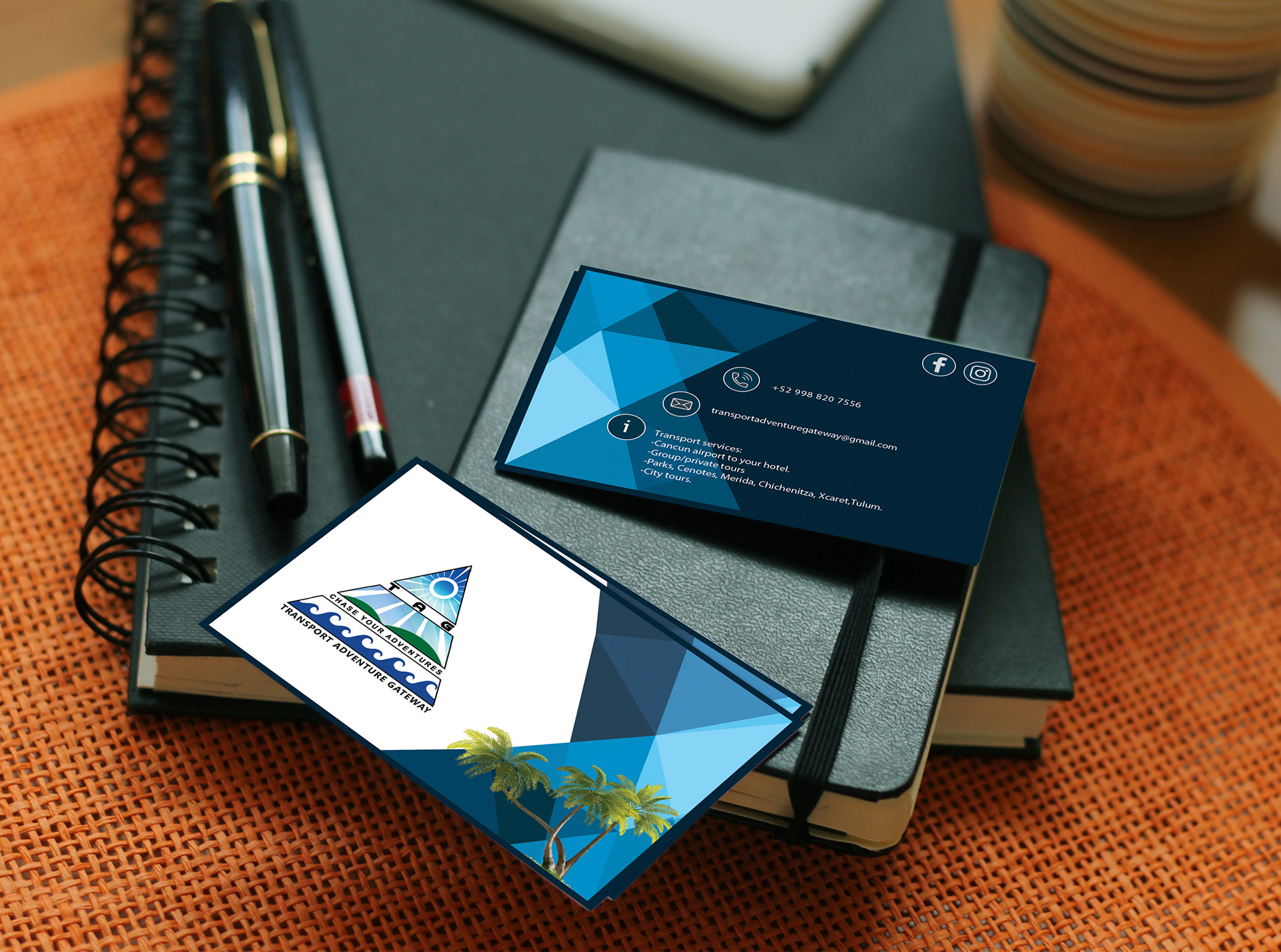
Transport Adventure Gateway is a boutique transportation company located in Cancun, Mexico. In order to revitalize its brand identity, I embarked on a design journey that involved a modern reinterpretation of the original concept. The client's vision entailed preserving the authenticity of palm trees and blue waves, emphasizing a more realistic representation. To achieve this, I employed the technique of overlaying shapes, meticulously crafting a wave-like pattern reminiscent of ocean waves. Careful consideration was given to negative space, allowing the logo to seamlessly integrate within the design. Through this creative process, the concept was transformed into a visually engaging representation that aligns with the client's objectives while infusing a contemporary aesthetic.
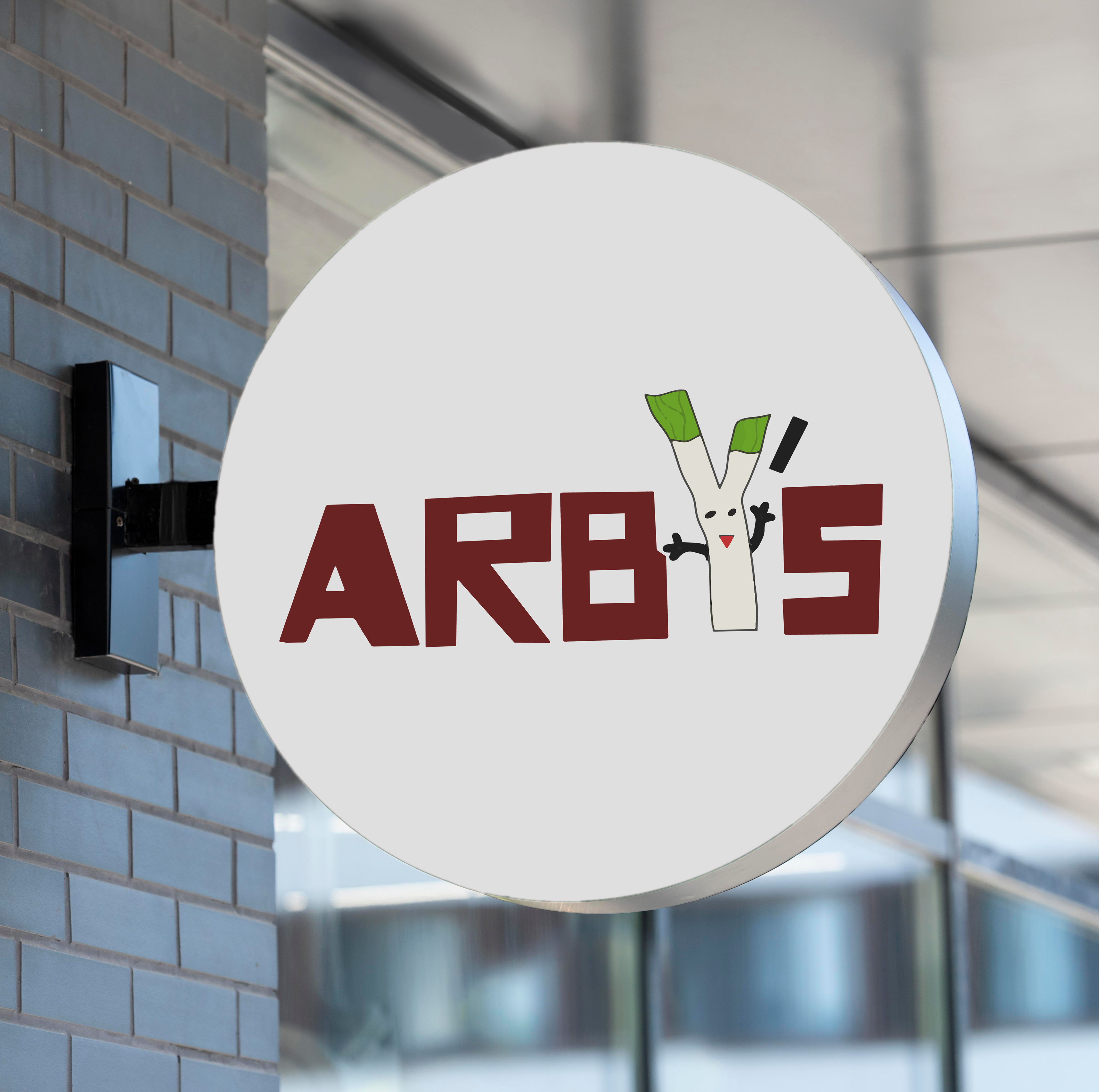
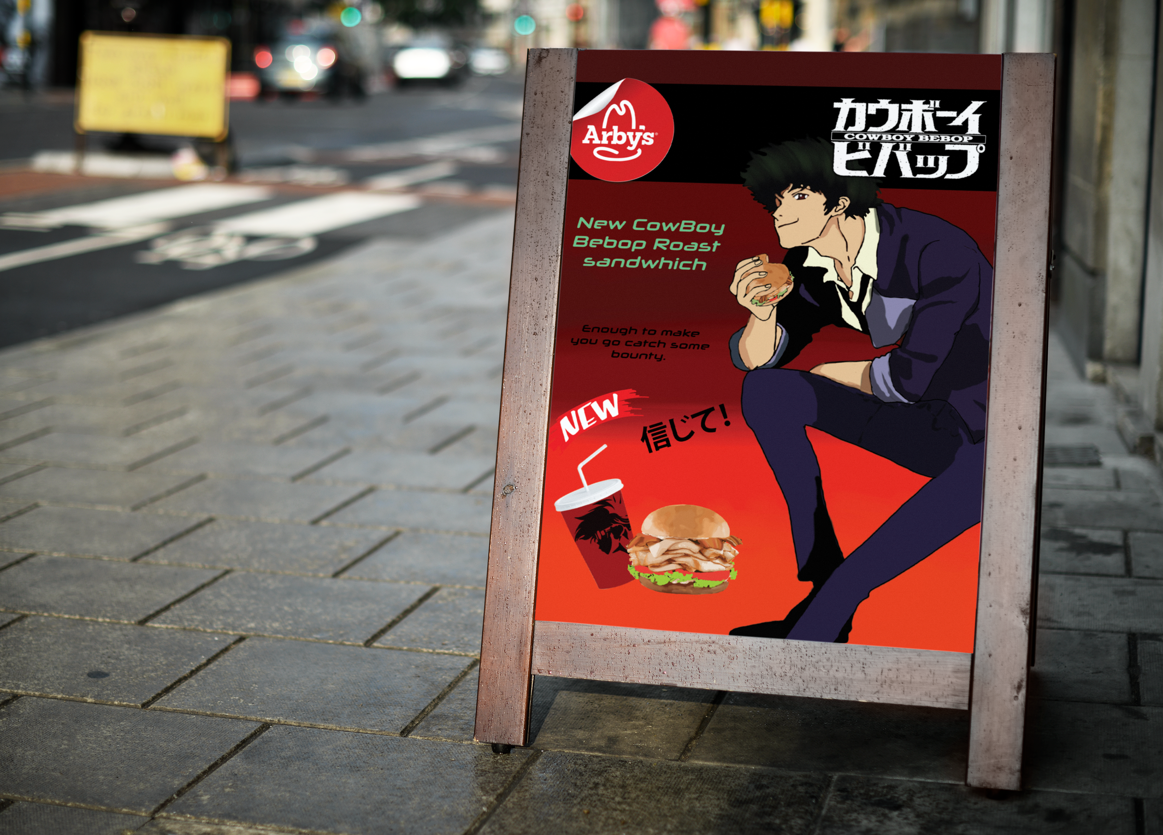
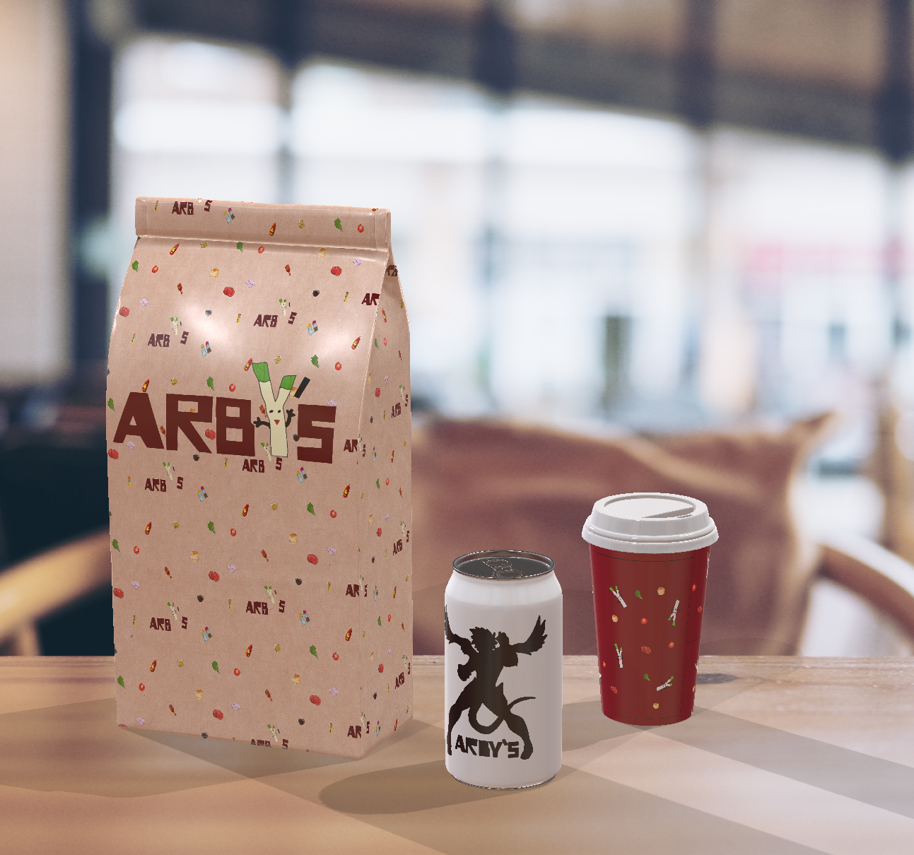
The rebranded initiative for Arby's, encompassing a comprehensive overhaul of their logo, advertisements, and packaging. The primary objective was to cultivate a captivating and appealing environment targeted specifically towards Anime enthusiasts. The redesigned logo features an adorable chibi mascot, strategically chosen as the brand's charismatic spokesperson for advertisements and events. Notably, the letter Y was ingeniously replaced with a Leek, skillfully crafted with arms and a friendly face, adding a distinctive touch to the visual identity. To further enhance the brand's appeal, I incorporated elements from the popular show "Cowboy Bebop" into the advertisements, captivating the target audience's attention and fostering a sense of connection. The packaging design followed a captivating pattern, cleverly reminiscent of the sandwich ingredients, designed to evoke nostalgia and a delightful sense of joy akin to the fond memories associated with a cherished "happy meal." This comprehensive rebranding effort aimed to create a unique and enticing dining experience tailored explicitly for the younger demographic.
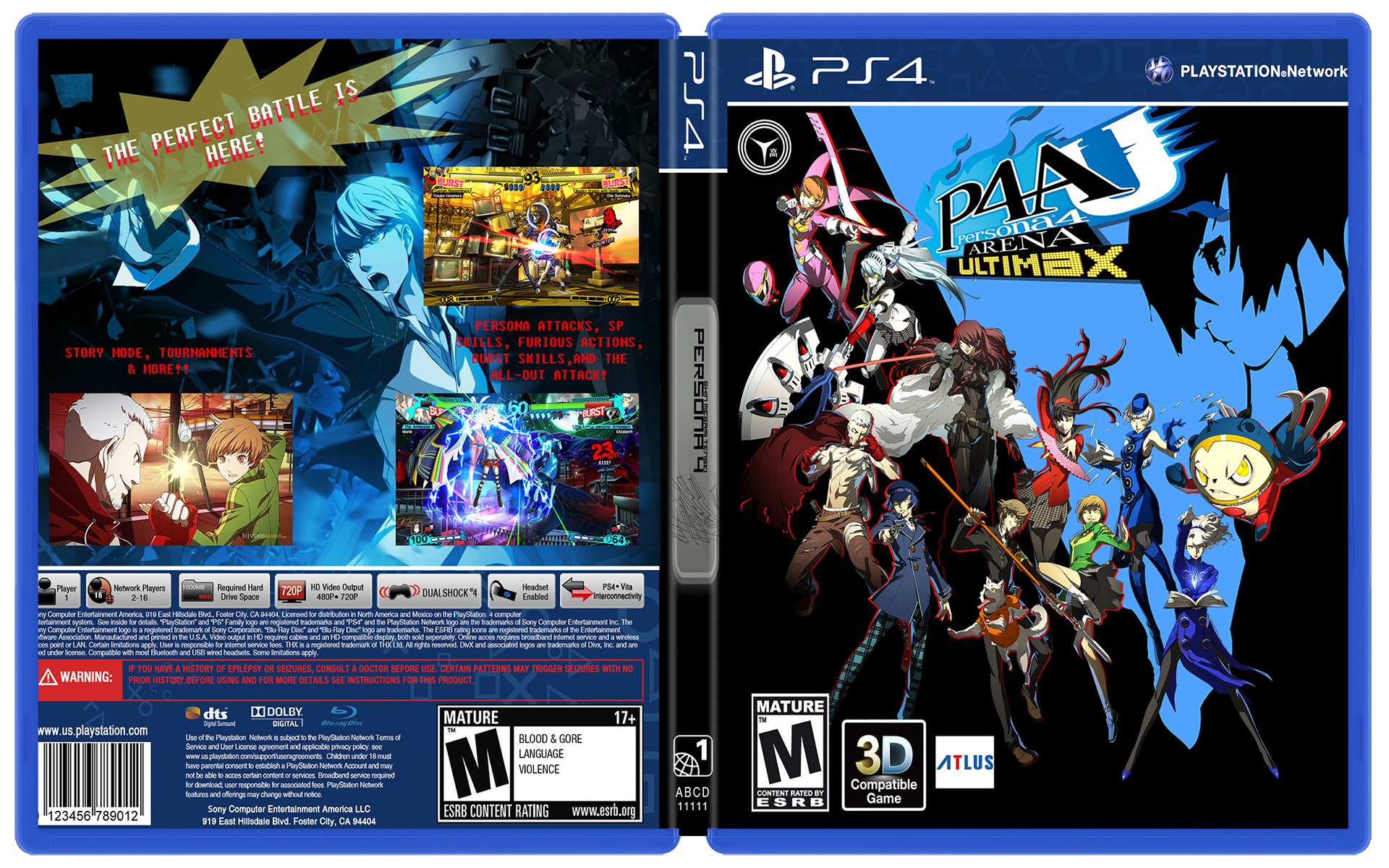
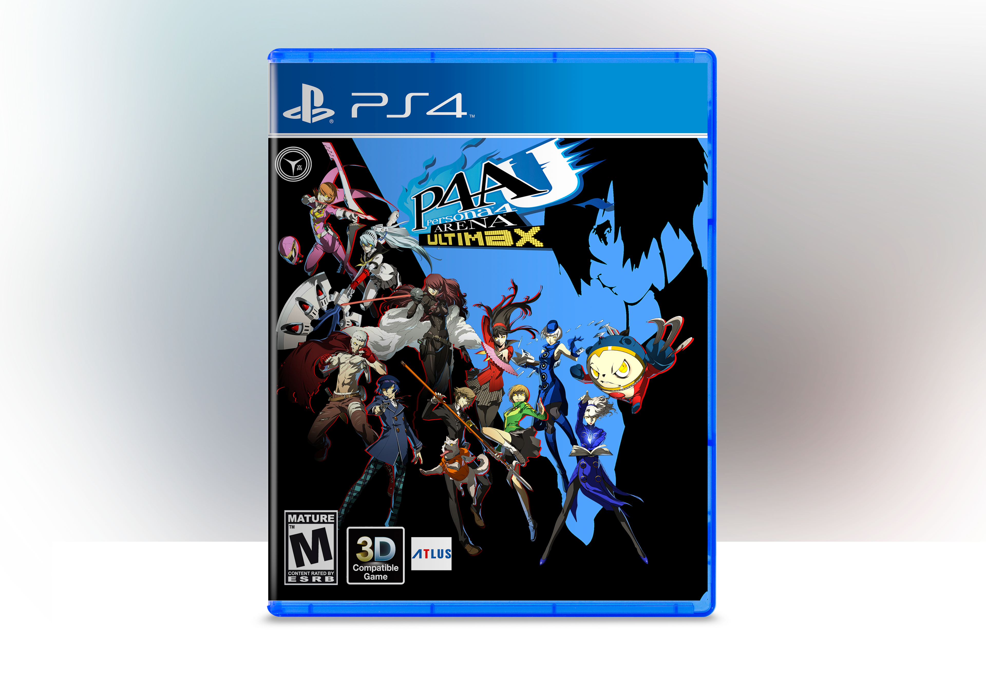
Designing the PlayStation 4 box cover art for the highly acclaimed game titled "Persona 4 Arena Ultimax." This involved the meticulous creation of a captivating photo composition using advanced techniques in Adobe Photoshop. The objective was to craft a visually striking and enticing cover that accurately represents the essence and allure of the game. Through careful consideration of layout, typography, and imagery, the resulting box cover art showcases a seamless fusion of design elements that effectively captivate potential players and entice them to explore the immersive world of "Persona 4 Arena Ultimax."
Drawing inspiration from the compelling short story "Halloween" authored by Venita Blackburn, I embarked on a creative journey to conceptualize and design a book cover that effectively conveyed the narrative essence while skillfully integrating typography and photography. My intention was to elicit a visceral response, evoking a sense of fear and adrenaline within the viewer. To achieve this, I meticulously orchestrated and photographed a unique scene, opting for a live-action approach rather than relying solely on illustration or text placement. Through meticulous manipulation and adaptation, the resulting imagery was seamlessly integrated into the context of the book cover, encapsulating the essence of the story in a visually captivating manner.
